momo
2020
Customer Service Redesign: a clearer, friendlier support chat
I redesigned momo’s in-app customer service interface so shoppers can find answers more easily and feel supported when they need help urgently.

Overview
Modernizing a service interface nobody had touched in years
The momo customer service interface had been in use for many years without a major update. To improve momo's service quality, we revised it: making the interface more modern and making it easier for users to find the buttons they are looking for.
The challenge
This redesign was not technically difficult, but it came with a common problem. Many requests like this come from other departments that don't yet know what they want. If we can't agree on the same objective at the start, it's easy to end up with multiple proposals and none that work.
Research
Learning from other customer service interfaces
After discussion with the team, the design focused on two key points:
Make information clearer.
Optimize the experience so that consumers who urgently need help have a good feeling.
Competitor analysis
I started with competitor analysis, looking into other online customer service interfaces for ideas on future functions.
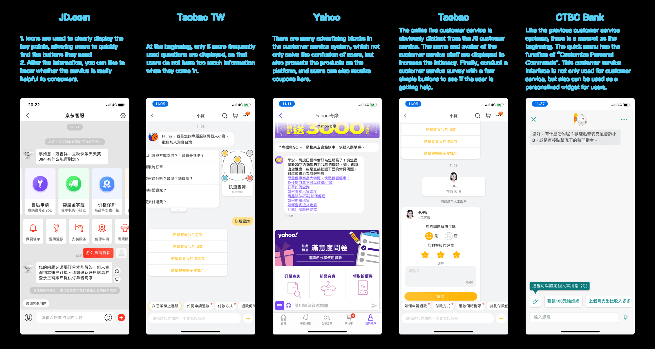
JD.com uses icons to display the key points clearly so users quickly find the buttons they need, and asks after each interaction whether the service was really helpful.
Taobao TW shows only five of the most frequently used questions at the start, so users don't face too much information when they arrive.
Yahoo has many advertising blocks in its customer service. They not only resolve confusion but also promote products, and users can receive coupons there.
Taobao makes its live customer service clearly distinct from the AI service. It shows the agent's name and avatar to build intimacy, and ends with a simple-button survey on whether the user got help.
CTBC Bank has a quick menu that works as "Customize Personal Commands", so the interface serves as both customer service and a personalized widget for users.
Design
Clearer information, clearer people
Final design
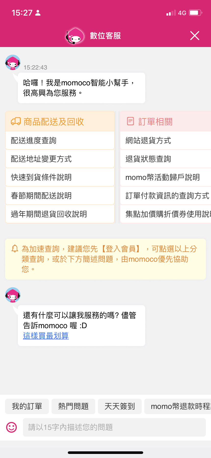
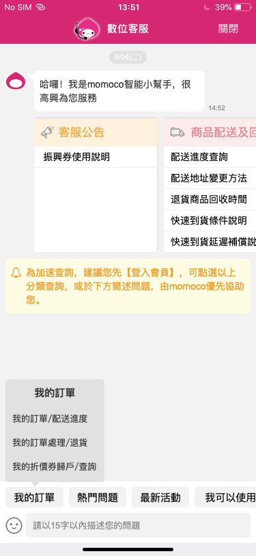
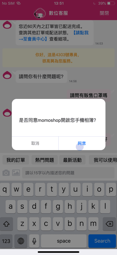
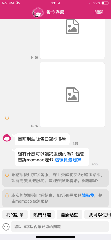
The redesigned interface
Through the redesign, the interface quality and user experience improved. Users can find information more easily, which we expect to reduce customers' anxiety.
Reflection
What I learned
Understanding users and the company
This revision was initiated by the customer service center, but the scope was not very clear, so we did a lot of research early on. I studied customer service interface practices from many domestic and foreign e-commerce platforms and sought suggestions from multiple consumers in order to make several proposals.
Some features still failed for reasons beyond our control. For example, displaying a "call a real person" function (as Tmall and Taobao do) seems to benefit users, but the company does not have enough resources to provide that service. What the company can afford is an important consideration in design, and one I should weigh more in the future.


